Art Design
Elements and principles of art, color theory, swatches, visual communication, figure-ground perception, gestalt laws, perceptual organization, stamps, stencils, prints, posters, supergraphics, applied art pieces, content illustration, concepts expression, visualization, illustrative line work, book covers, interiors, visual plans and drafts, functional drawing, prototypes, graphic design, fashion design, needlework, decorative arts and crafts.
Design - an arrangement of elements or details in a work of art or a product, the creative art of executing aesthetic or functional visions.
Illustration
 - decoration, interpretation or visual explanation of a text, concept
or process, designed for integration in print and digital published
media.
Applied arts - design and decoration of practical objects to make them aesthetically pleasing.

Art Elements
Color, Line, Shape, Texture, Form, Space, Materiality, Markmaking
- Author: Lena Nechet
- ▲ Art Studio
- ▼ Art Design

Art Principles
Emphasis, Contrast, Proportion, Rhythm, Balance, Harmony
- Author: Lena Nechet
- ▲ Art Studio
- ▼ Art Design
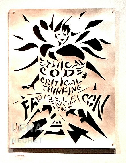
Poster paper cut - an example of poster of meaningful persuasion made bu cutting a paper board, underlaid with a contrasting black. It can be used as a stencil.
The shield is presented as a flower receptacle, held by a fairy (or an elf), whose one hand holds the shield, and another, right hand, is in a protective gesture. The fairy's hair is the flower petals. The shield with a writing in a leaf-like font deters sharp arrows of informational attacks.
This work offers to the viewer three main principles to defend yourself from disinformation and manipulation, represented with fake, con, and lie:
- Ethical code - strong moral convictions.
- Critical thinking - skills in forming a judgement by analyzing of available facts, observations, and arguments to form a judgment.
- Self-knowledge - knowing your personality, psychology, and biology, paying attention to own mental states - self-awareness and self-consciousness.
Disinformation - false information deliberately and often covertly spread in order to deceive people, a type of propaganda.
- Author: Lena Nechet
- ▲ Art Studio
- ▼ Art Design
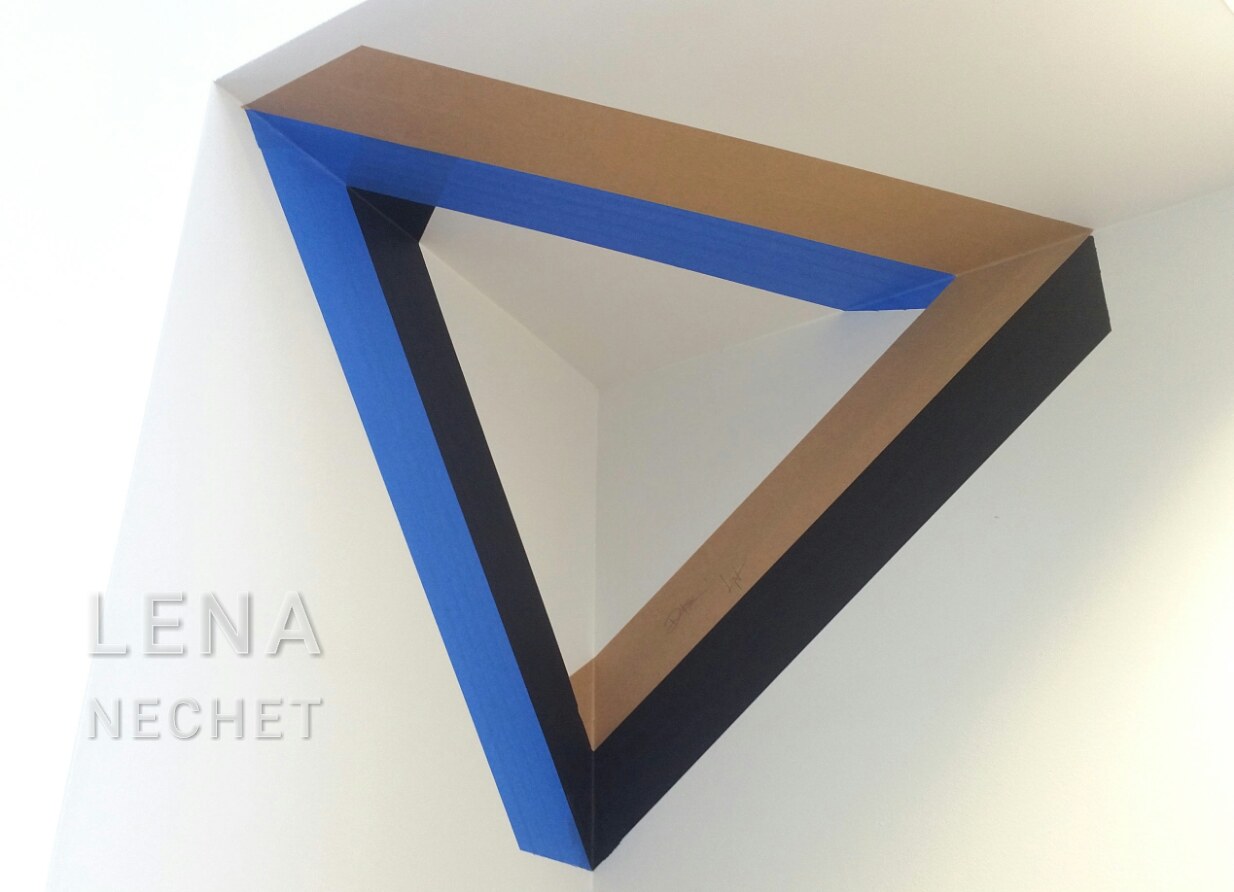
This wall installation is my project with a fellow artist Derek Fox. It was installed on May 17, 2022 in a college building. We have decided to attempt to insert an impossible triangle into an upper corner of a water fountain. It creates an illusion of changing shape when one walks through the corridor. Our install time was limited to thirty minutes, so we had prepared sketches with measurements and discussed the workflow in details.
- Author: Lena Nechet
- ▲ Art Studio
- ▼ Art Design
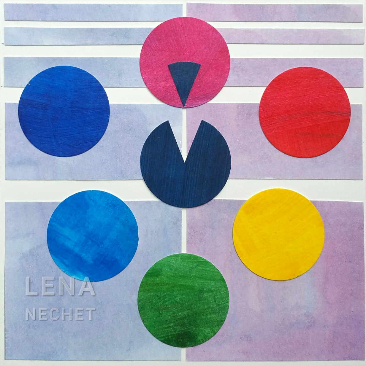
This is a form of a color wheel, pointing to the disconnect in a physical wavelength on magenta. The warm hues on the right have a warmer muted magenta background than the cool hues on the left. The green and the mind-generated magenta can be both. The colors have similar circular shape, an element of art design, which creates rhythm, an art design principle. The larger circle they create illustrates balance, and the emphasis is on magenta - both also are basic art design principles.
- Author: Lena Nechet
- ▲ Art Studio
- ▼ Art Design
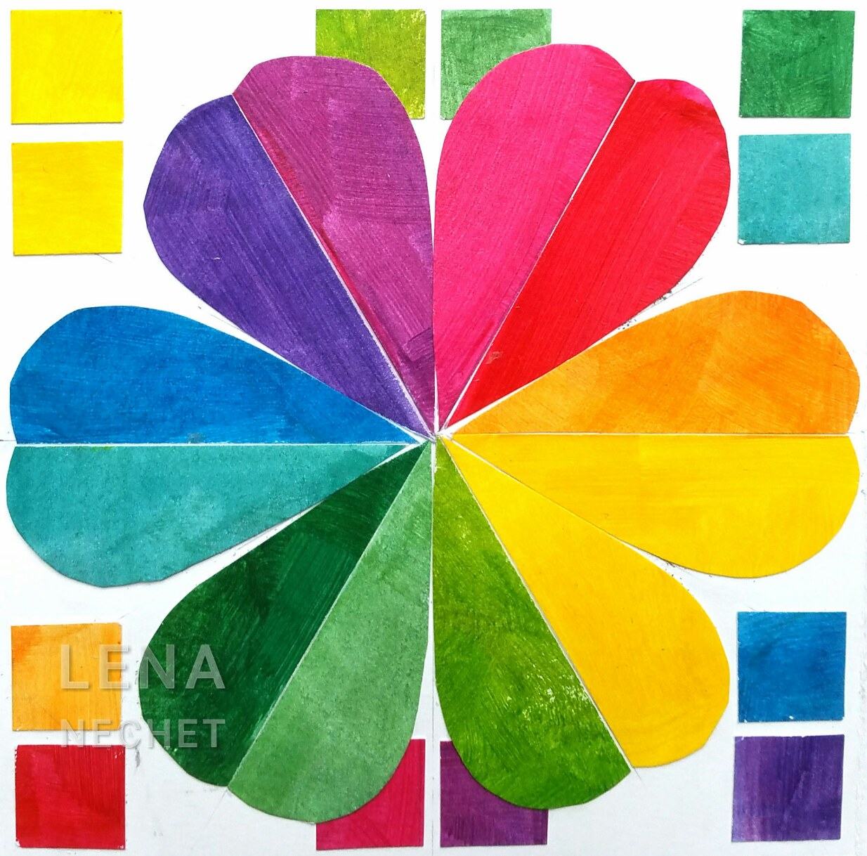
This is a flower-shaped 12-hue color wheel, with squares of opposite color next to each petal, a split of a cool and warm version of the similar hue. Warm hues are on the right: cool and warm red, orange and mid-yellow, cool lemon yellow and lime colors. The are followed by the cool colors on the left: warm and cool green, cyan and royal blue, violet and purple. Hue is an attribute of color, an art design element. The six petals illustrate harmony, an art design principle.
- Author: Lena Nechet
- ▲ Art Studio
- ▼ Art Design
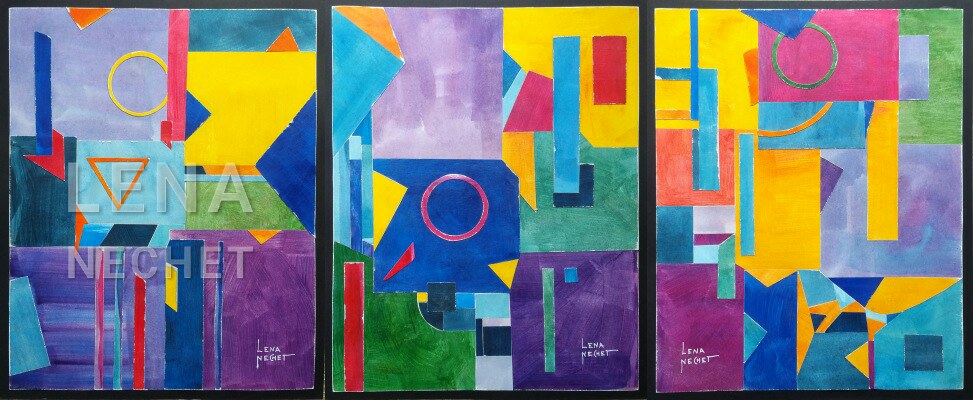
This triptych collage is an example of implementing contrast in color hues and values.
- Author: Lena Nechet
- ▲ Art Studio
- ▼ Art Design
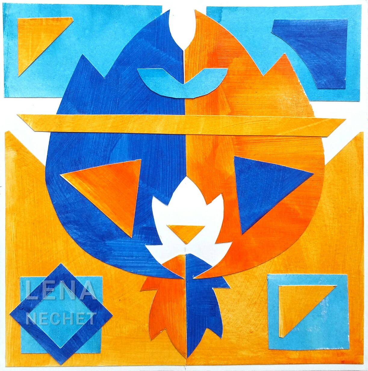
This collage demonstrates four complimentary colors - blue and orange, dark and light each. Juxtaposing dark and light blues and oranges serves as an example of color and value contrast - one of the art design principles. And the accent on the central floral shape by a negative space illustrates another art design principle: emphasis, as well as an element of art design: space.
- Author: Lena Nechet
- ▲ Art Studio
- ▼ Art Design
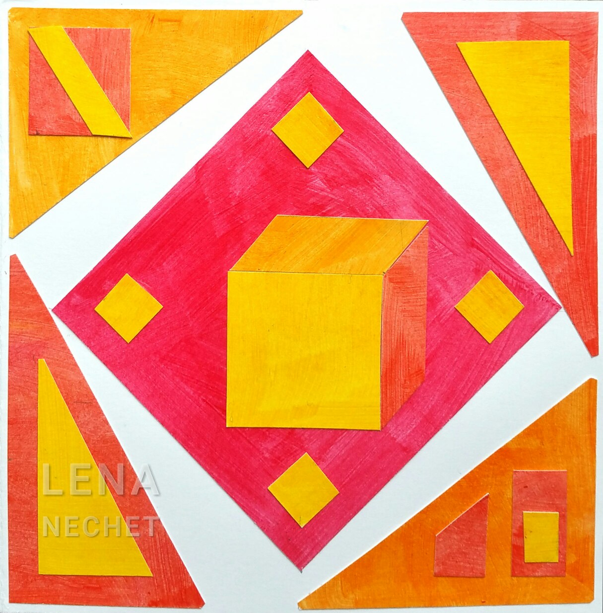
This simple collage demonstrates warm analogous colors - from red to yellow. An illusion of a three-dimensional object in the middle illustrated form as an element of art design. The composition is balanced with other geometric shapes to serve as an example of balance - one of the art design principles.
- Author: Lena Nechet
- ▲ Art Studio
- ▼ Art Design
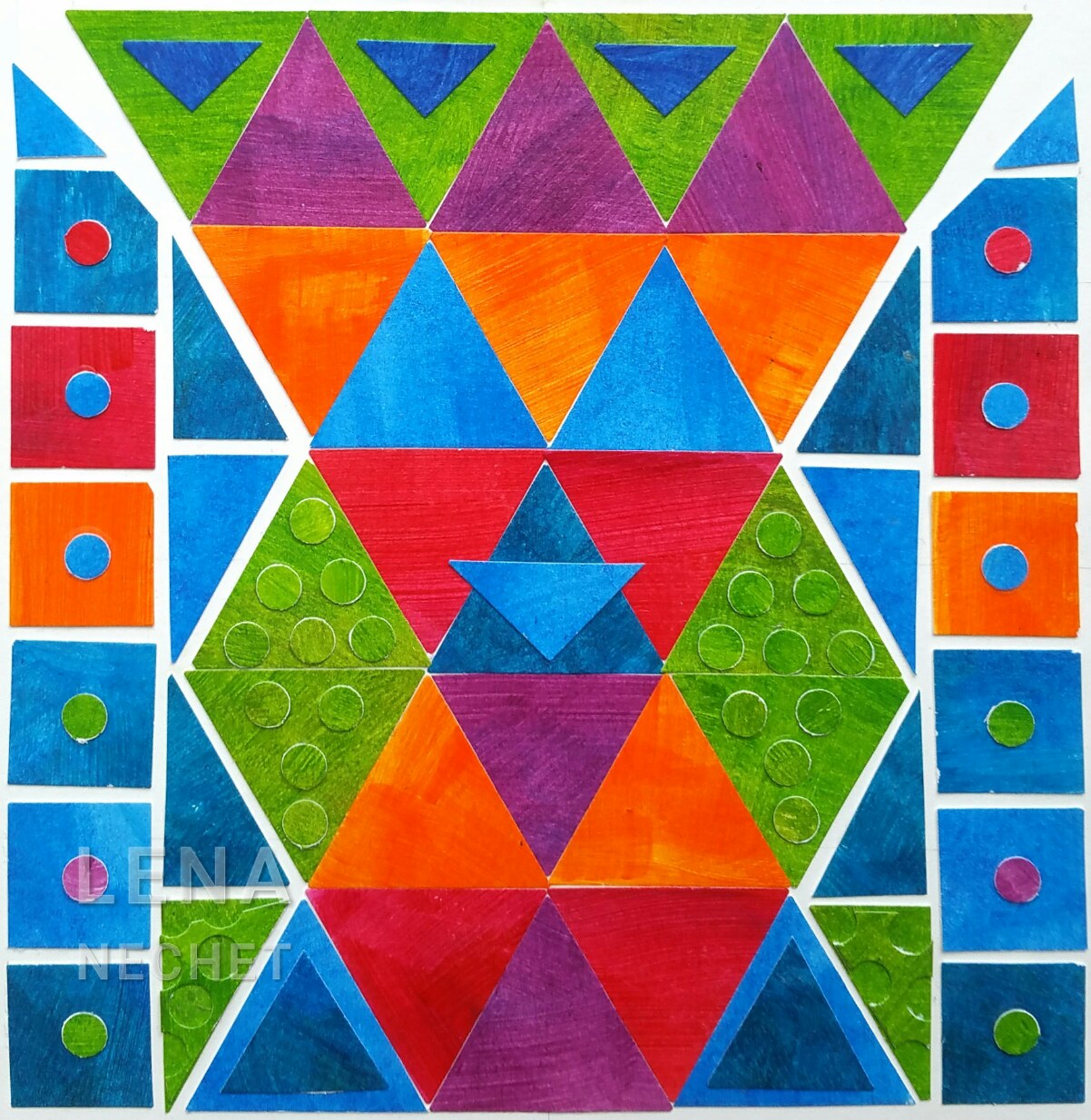
This collage in six tertiary colors demonstrates an art design element texture, including a pattern. Some pattern is created by contrasting violet and green or orange and blue triangles on the schematic vase and with circles on squares in the background. Some texture is created with the same hue by positive and negative shades (in green), using a low contrast (a design principle) created by change of brushstroke direction and by the white of the cut visually - visual texture, and by paper edges casting slight shadow - tactile texture - in a collage you can feel it as a relief.
- Author: Lena Nechet
- ▲ Art Studio
- ▼ Art Design
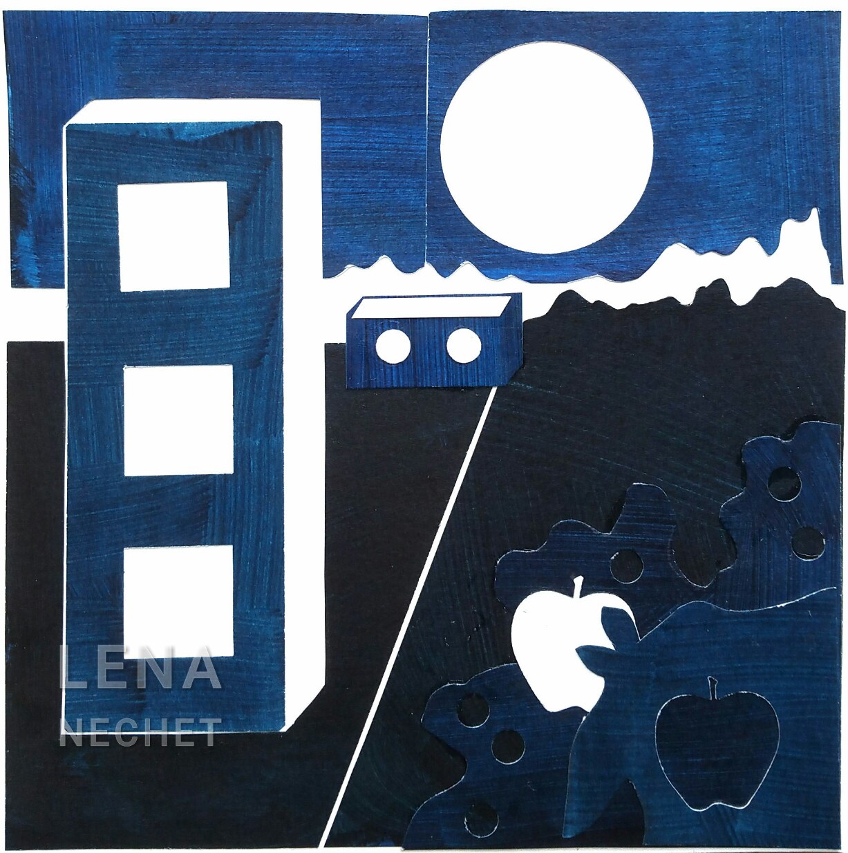
This collage demonstrates six color shades of blue blue. The emphasis, an art design principle, is made with negative shapes (white background), an element of art design: space - the dark value of blue contrasts with the lightest value. The rectangular shapes in perspective illustrate proportion, another art design principle.
- Author: Lena Nechet
- ▲ Art Studio
- ▼ Art Design
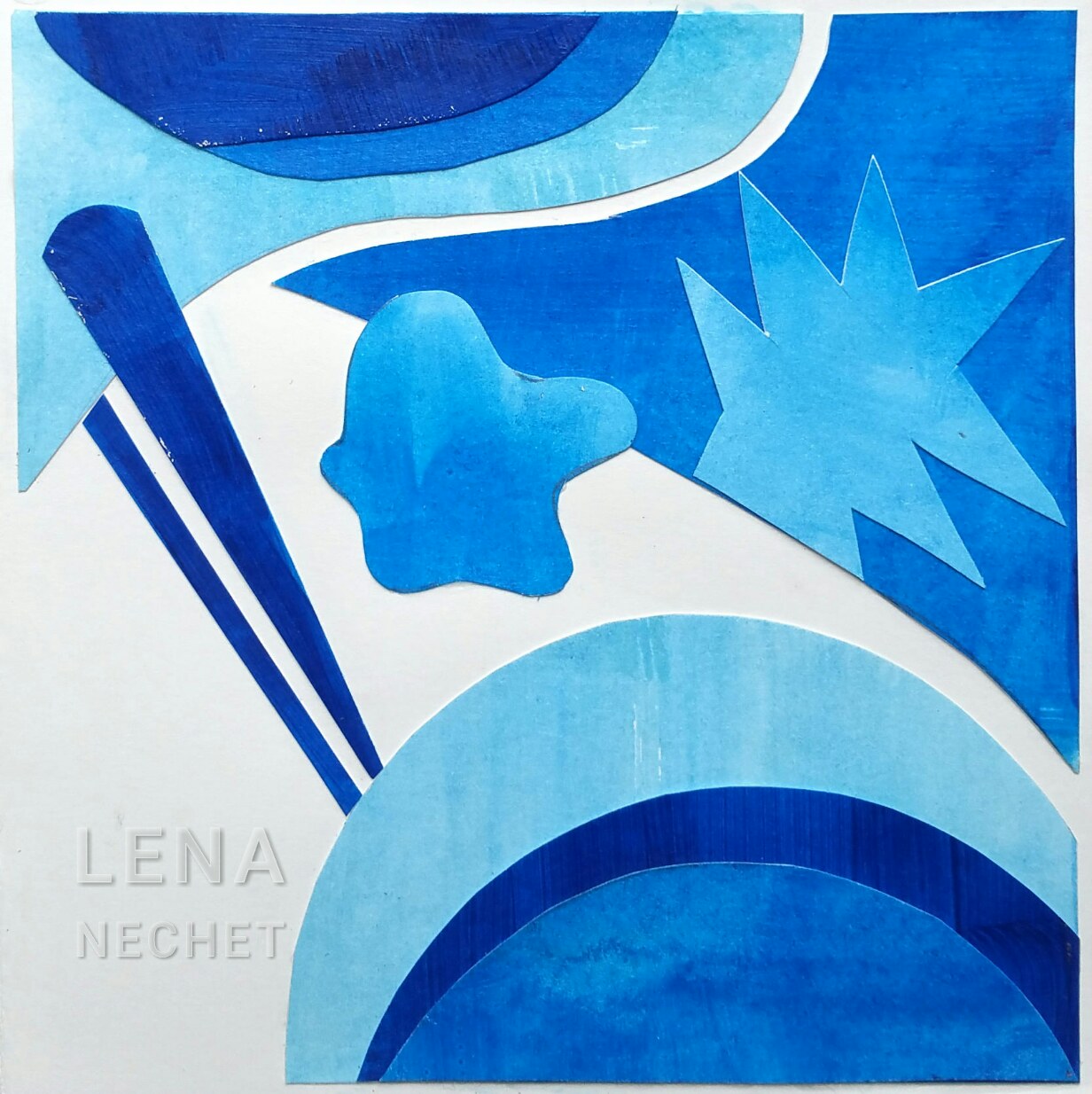
This collage in six tints of one color, from mid-value to sky-blue, illustrates saturation of color, a main art design element. With just changes in color saturation in a monochrome image, one can achieve both gradual change and contrast. It also demonstrates variety, one part of the art design principle harmony, with shapes of different sizes and and contours.
- Author: Lena Nechet
- ▲ Art Studio
- ▼ Art Design
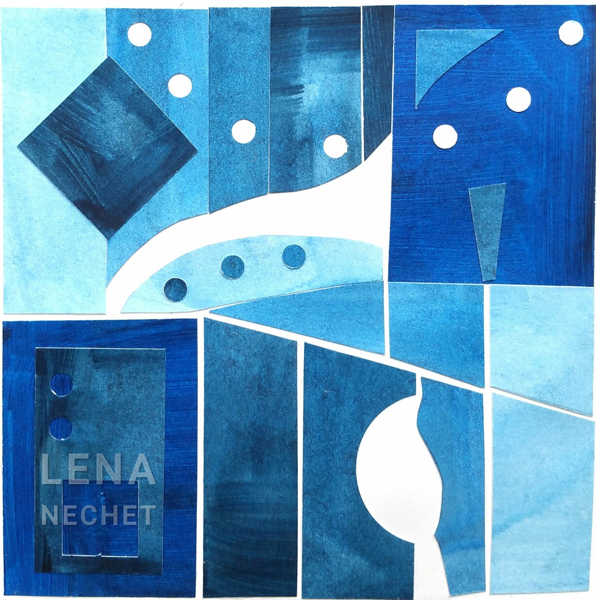
This collage in six color tones demonstrates line as an element of art design and rhythm as an art design principle. A tone is a color that has been mixed with grey. The several muted tints and shades of blue produce enough distinction for the monotone abstract. The dots of negative (cut out) and positive (glued on) space - white and blue create some rhythm, as well as vertical lines.
- Author: Lena Nechet
- ▲ Art Studio
- ▼ Art Design
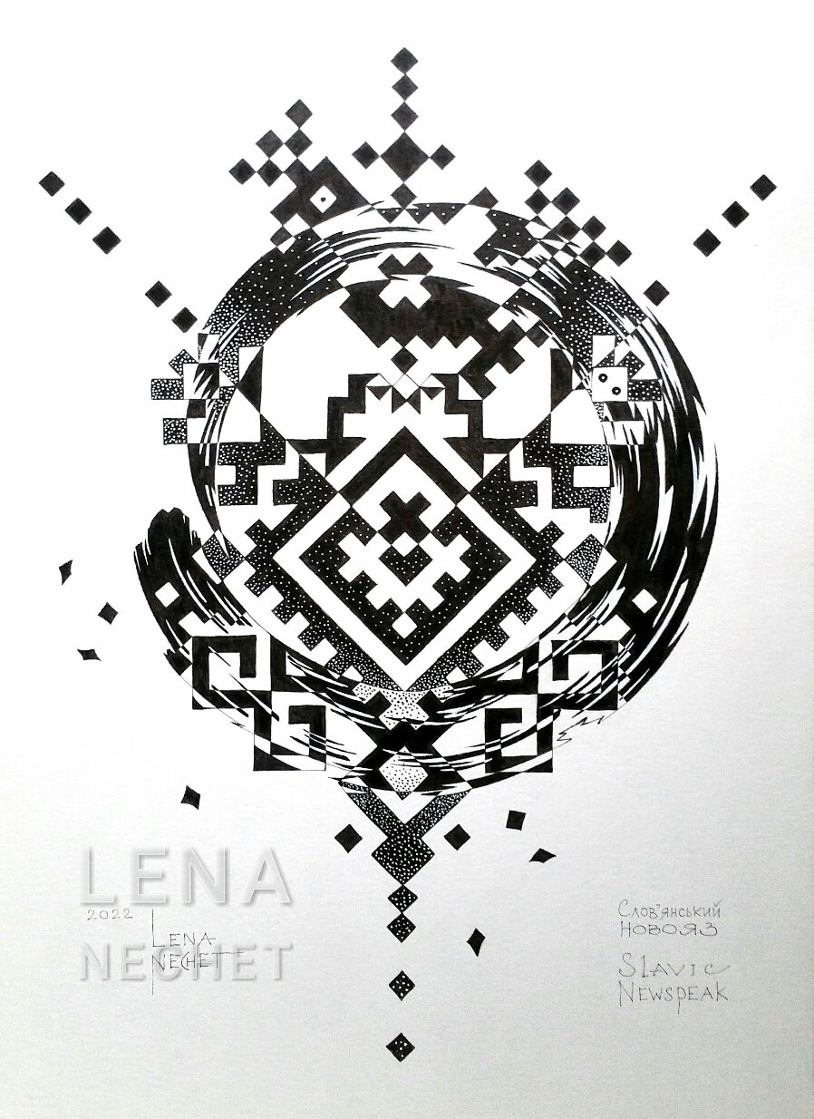
This is an example of partial reversal of figure and ground in pen and ink. The angular shape from the top reverses values of the content in the middle: from white to black and vise versa. This work has areas of geometric and organic design, and uses motives from three different cultures, that were my influences.
Description of this work: Slavic Newspeak.
- Author: Lena Nechet
- ▲ Art Studio
- ▼ Art Design

This is an exercise in composition to express concepts with black simple shapes, squares.
The feelings are: boldness, congestion, loneliness, tension, excitement. Same with rectangles.
- Author: Lena Nechet
- ▲ Art Studio
- ▼ Art Design

This is another exercise in composition: expressing the same concepts with rectangles (same in squares).
Feelings sequence: excitement, congestion, boldness, loneliness, tension.
- Author: Lena Nechet
- ▲ Art Studio
- ▼ Art Design
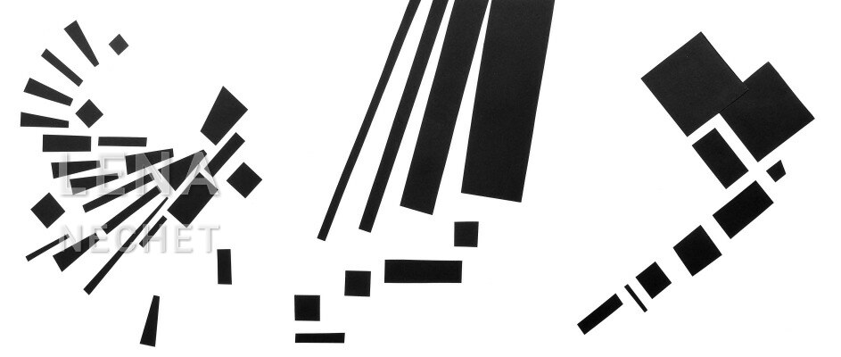
Visualizing sounds: an ocean wave, a forest wind, and an awl's hoo-hoo.
- Author: Lena Nechet
- ▲ Art Studio
- ▼ Art Design
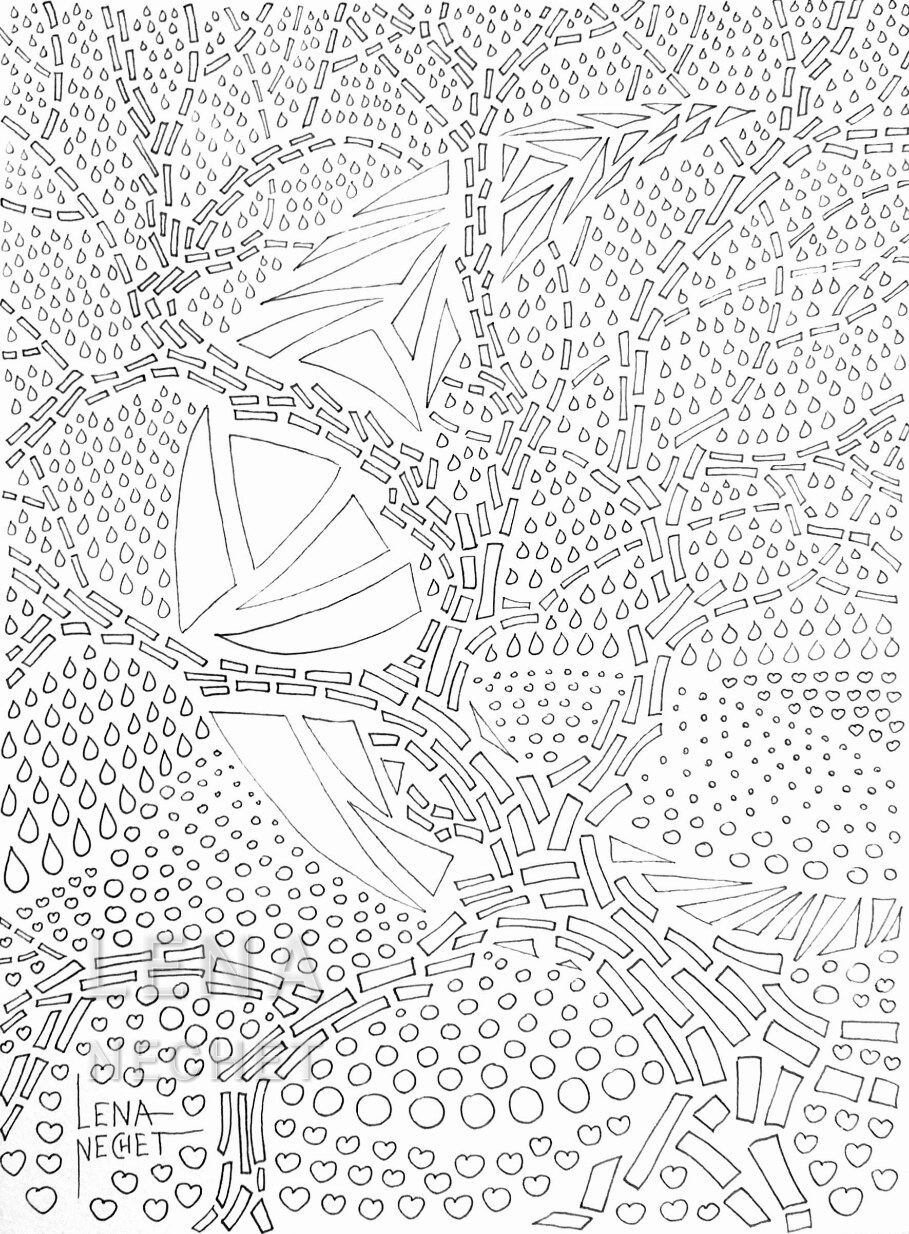
Visual texture here is composed of separate shapes, separated by evenly distributed space. On this stage of the painting, the four most basic shapes are just enclosed lines, topologically equal: circles, drops, flowers or hearts, and triangles. On the next stage, they will be distinguished additionally by color.
- Author: Lena Nechet
- ▲ Art Studio
- ▼ Art Design
